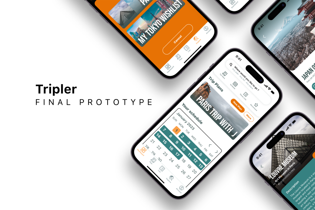
Tripler
UX/UI Case Study — Travel Planner App
Project Overview
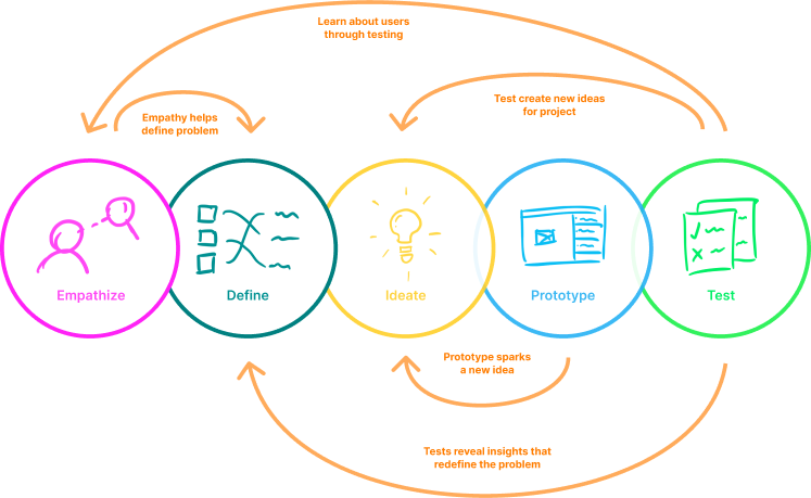
Design Thinking Process
Applied the full 5-stage Design Thinking framework throughout the project lifecycle.
User Research
Secondary Research: Benchmarked TripAdvisor and Airbnb to understand existing solutions and identify gaps.
User Interviews: 5 filtered participants · Zoom · 20–30 min each
Empathy Map
Synthesized interview findings into a shared empathy map — what users Say, Think, Do, and Feel during travel planning.
- "I want to travel but I don't know where to start"
- "Planning with friends is always chaotic"
- "I end up just copying what I did last time"
- Will I miss something important if I skip research?
- Is this destination safe / good for my budget?
- How do I keep everyone's preferences in mind?
- Searches multiple apps, tabs, and blogs separately
- Creates personal notes or spreadsheets to consolidate info
- Asks friends for recommendations via group chat
- Overwhelmed by the volume of decisions
- Anxious about making the wrong choice
- Excited about the destination — frustrated by the process
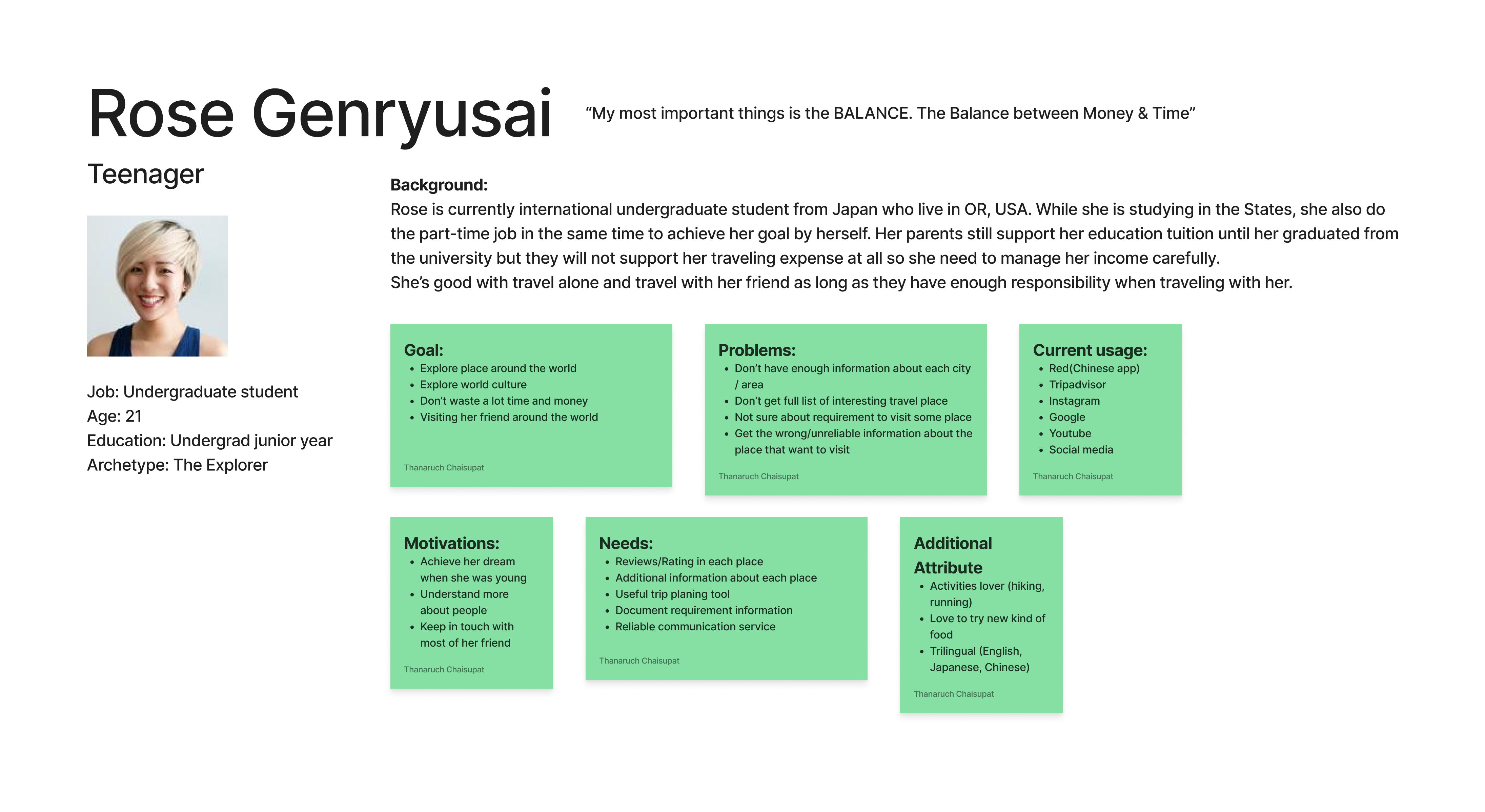
Personas
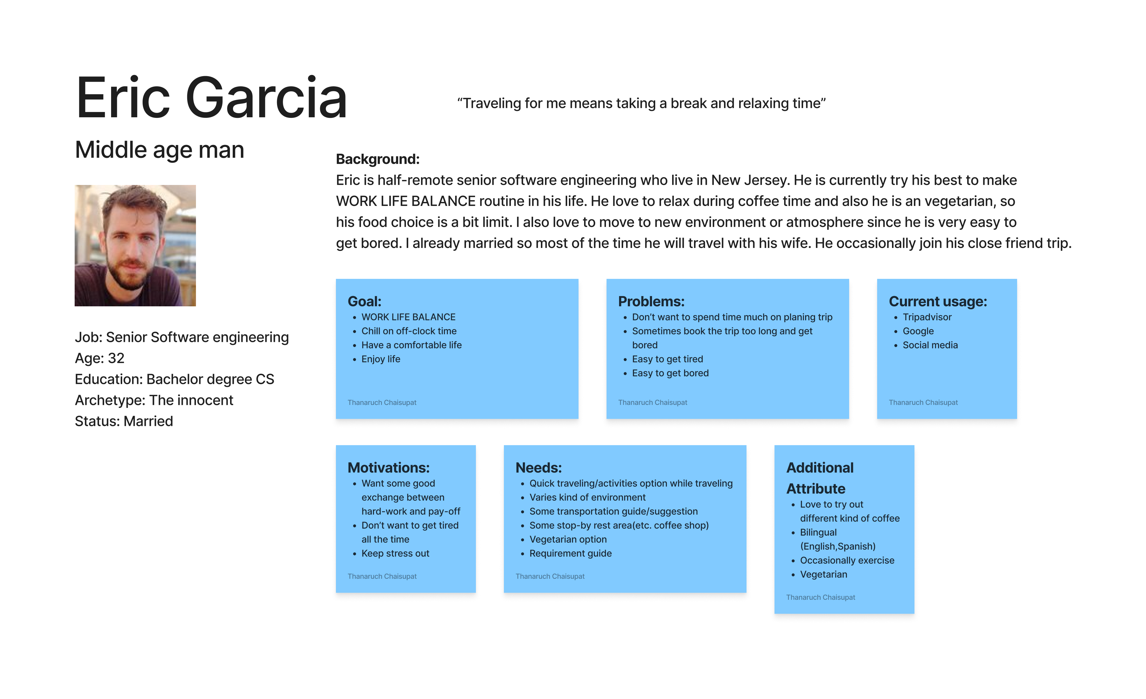
Two archetypes derived from research, representing the range of travel planning behaviors.
JTBD & HMW
Transformed pain points into design opportunities using Jobs To Be Done and How Might We frameworks.
Now Wow How — Feature Prioritization
Prioritized features using the NWH framework — separating baseline expectations from differentiation opportunities.
- Destination search & browse
- Itinerary creation by day
- Save places to a trip
- Map view of saved places
- Collaborative real-time trip editing
- Smart schedule conflict detection
- Curated local recommendations
- Trip sharing with view-only links
- Offline access to itineraries
- AI-based trip suggestions
- Multi-currency budget tracker
- Live flight / booking integration
MVP Sitemap & User Flows
Defined the MVP scope and mapped three core task flows.
Heuristic Analysis of Competitors
Evaluated Wanderlog, Tripit, and Sygic against Nielsen's 10 heuristics to surface usability gaps.
Low-Fi Sketches & Prototype
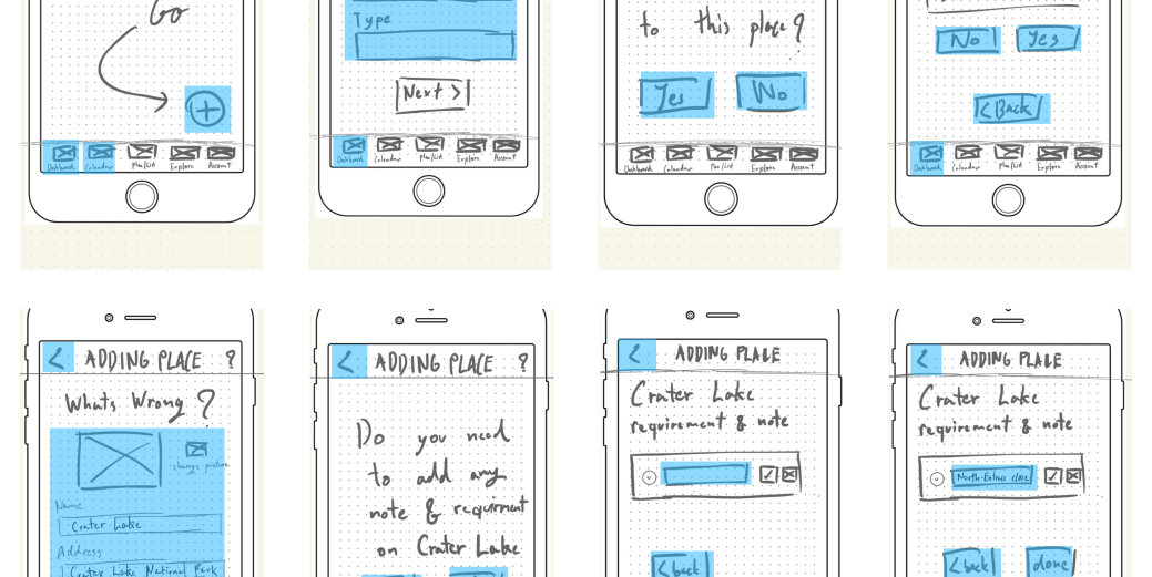
Hand-sketched wireframes for all three user flows. Built a first clickable prototype using POP by Marvel for concept validation before committing to digital wireframes.
Usability Test #1 — Lo-Fi
Type: Guerilla usability test · 5 participants
Location: Memorial Union Activity Center, Oregon State University, Corvallis, USA (in-person)
Wireframes — Mid-Fi Prototype
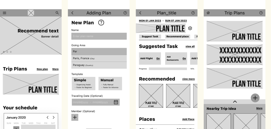
Built mid-fidelity wireframes covering all three user flows. Applied Test #1 findings: clarified labels, unified navigation structure, and improved information hierarchy.
Style Guide
High-Fidelity Prototype
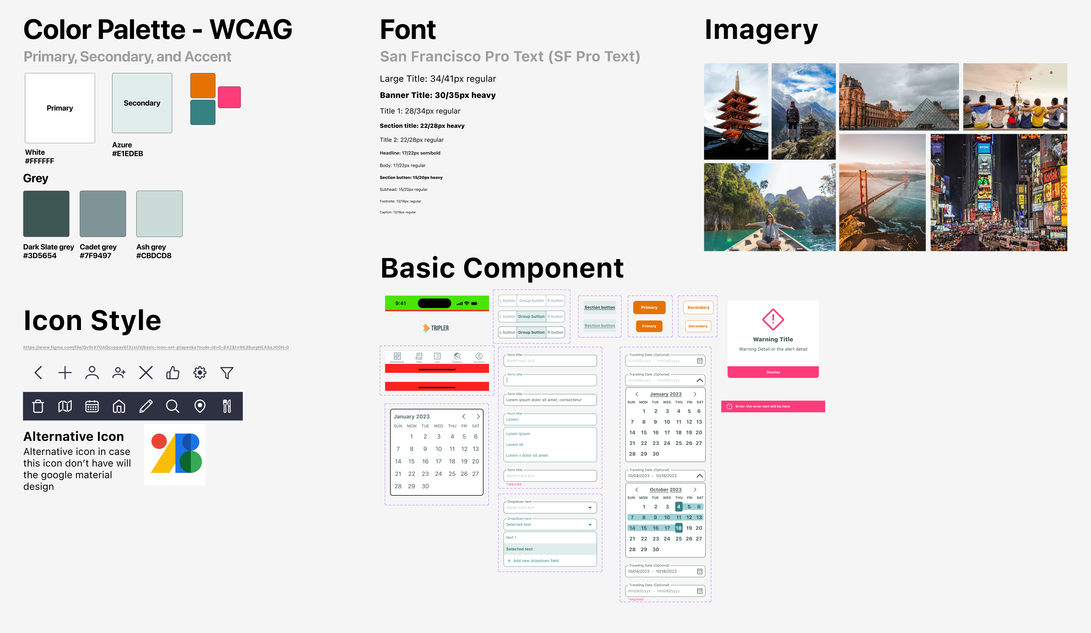
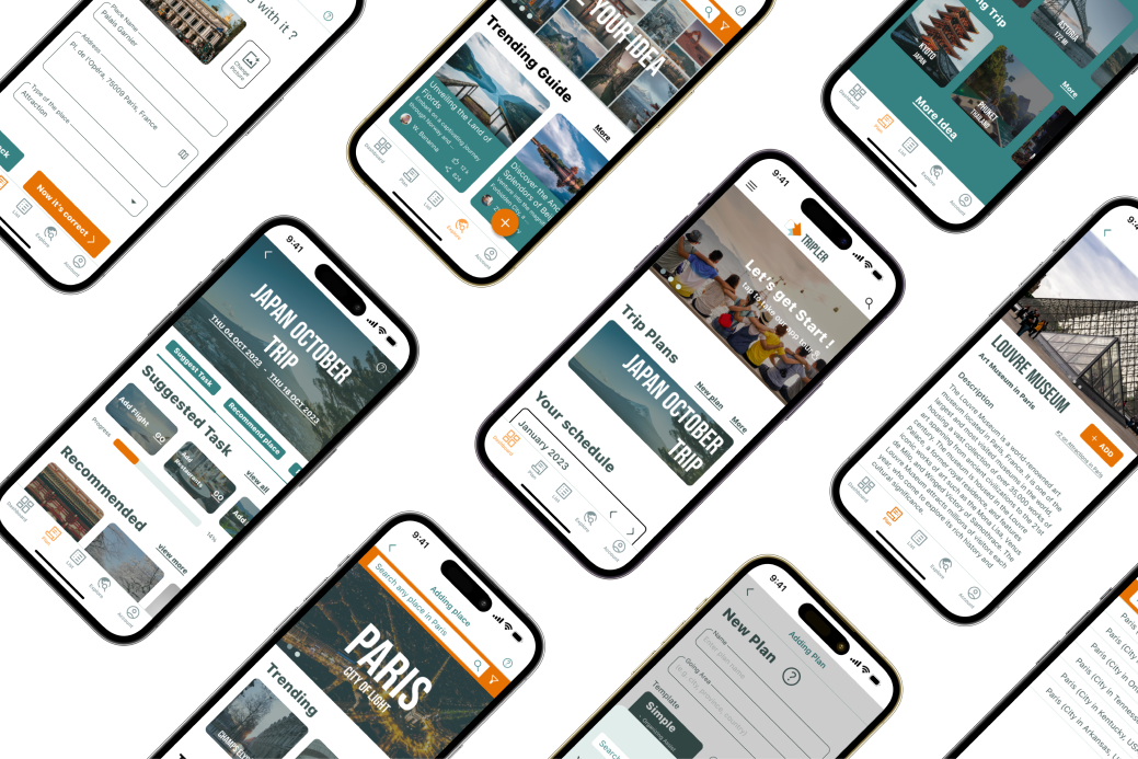
Translated wireframes and style guide into a full Figma hi-fi prototype. Covers all three task flows end-to-end, ready for usability validation.
Usability Test #2 — Hi-Fi
Type: Standard usability test · 5 filtered participants
Location: Zoom (remote)
Iterations & Improvements
Four targeted iterations based on Test #2 findings — addressing layout visibility, language consistency, task entry points, and navigation paths.
Iteration #1 — Layout: Main Action Visibility
The finalize/confirm CTA was anchored to the bottom of a long scrollable list — users never scrolled far enough to see it. Fixed by pinning the primary action as a floating button above the bottom nav, visible at all scroll positions.
Iteration #2 — Status Bar / Report Feature
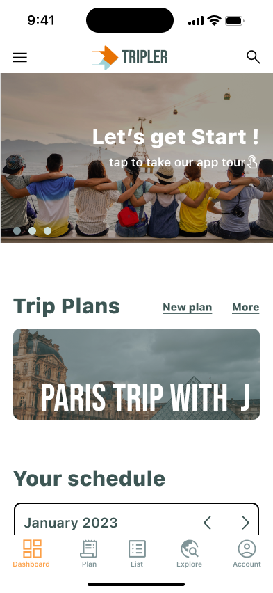
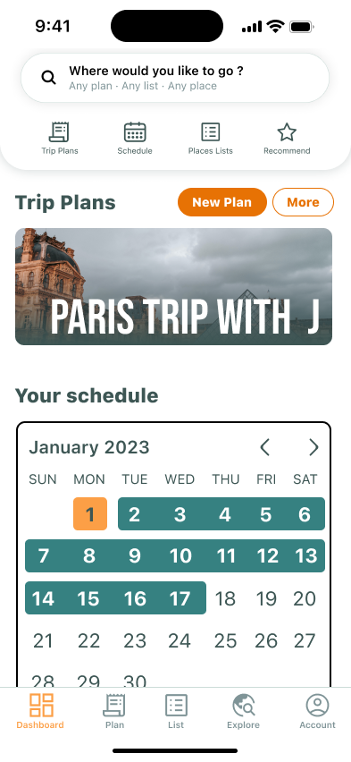
To minimize user confusion at task completion points, a status report feature was added. When users complete significant actions — such as creating a new travel trip — the app now provides a confirmation report, giving clear visibility of what was accomplished.
Iteration #3 — Entry Point Consistency
All three tasks now start from the same home screen. Previously, testers were dropped into different views per task — introducing a variable that skewed results and confused participants about where they were in the app.
Iteration #4 — Language Consistency
Audited every text label across all screens. Consolidated "More / View More / See More" into a single standard: "See More". Applied consistent verb patterns for all action buttons — never mixed with synonyms.
Iteration #5 — Missing Navigation Paths
Mapped all incomplete flows and implemented the missing back/edit routes. Users can now correct mistakes without losing progress — previously some paths were one-way with no recovery.
Usability Test #3 — Validation
Type: Standard usability test · 5 new participants (different from previous tests)
Location: Zoom (remote)
Outcomes & Lessons